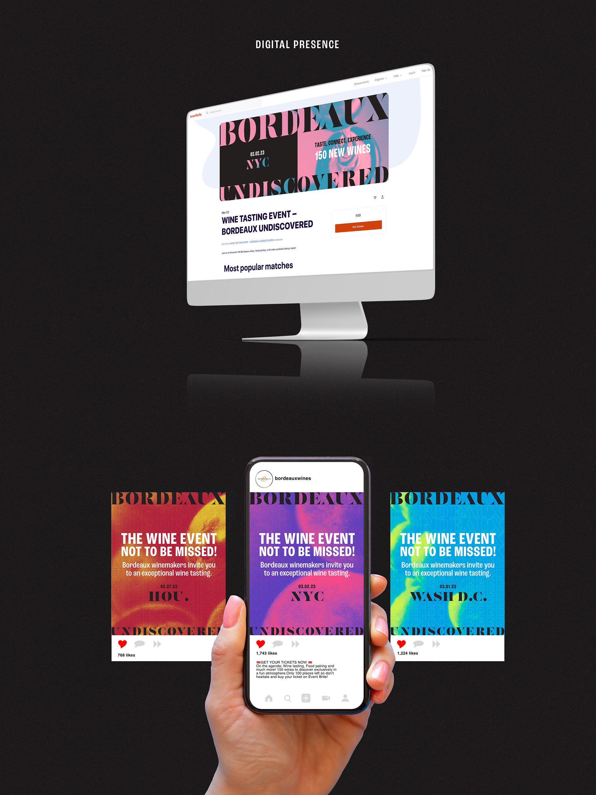
Bordeaux wines embarked on a three-day, three-city U.S. tour designed to introduce both their portfolio and a refreshed perception of the category to distributors and consumers in Houston, Washington, D.C., and New York City.
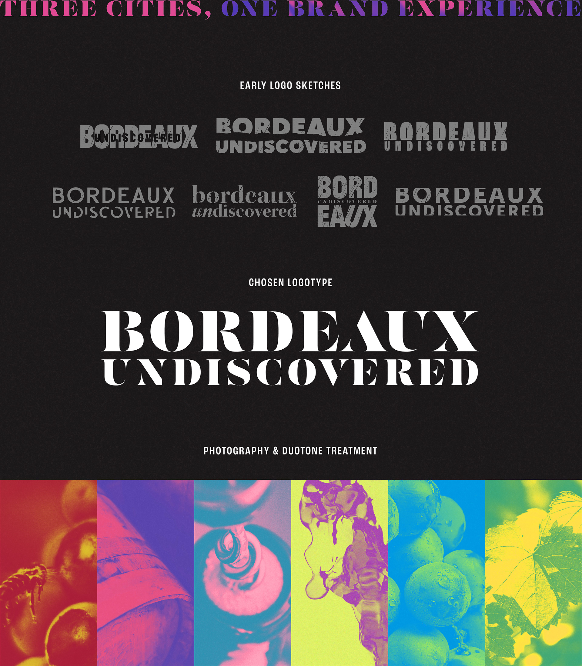
In collaboration with the Bordeaux Wine Council, the creative brief called for a name, visual identity, and event design that would reshape perceptions of Bordeaux among audiences aged 25–50. The goal was to balance the region’s deep heritage with a sense of modernity—showcasing the diversity of its varietals while highlighting Bordeaux’s innovation, sustainability, and accessibility to both experts and new enthusiasts.
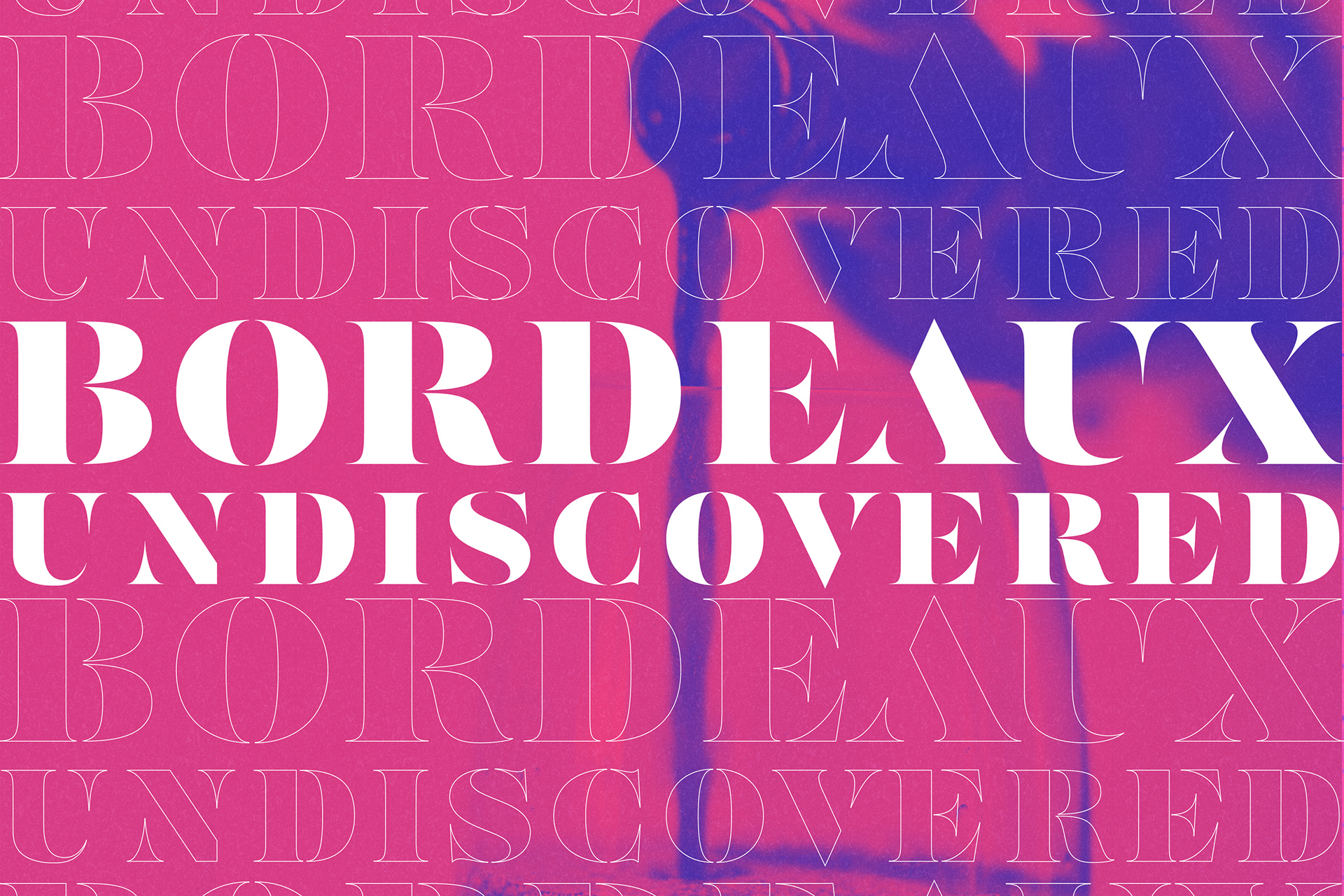
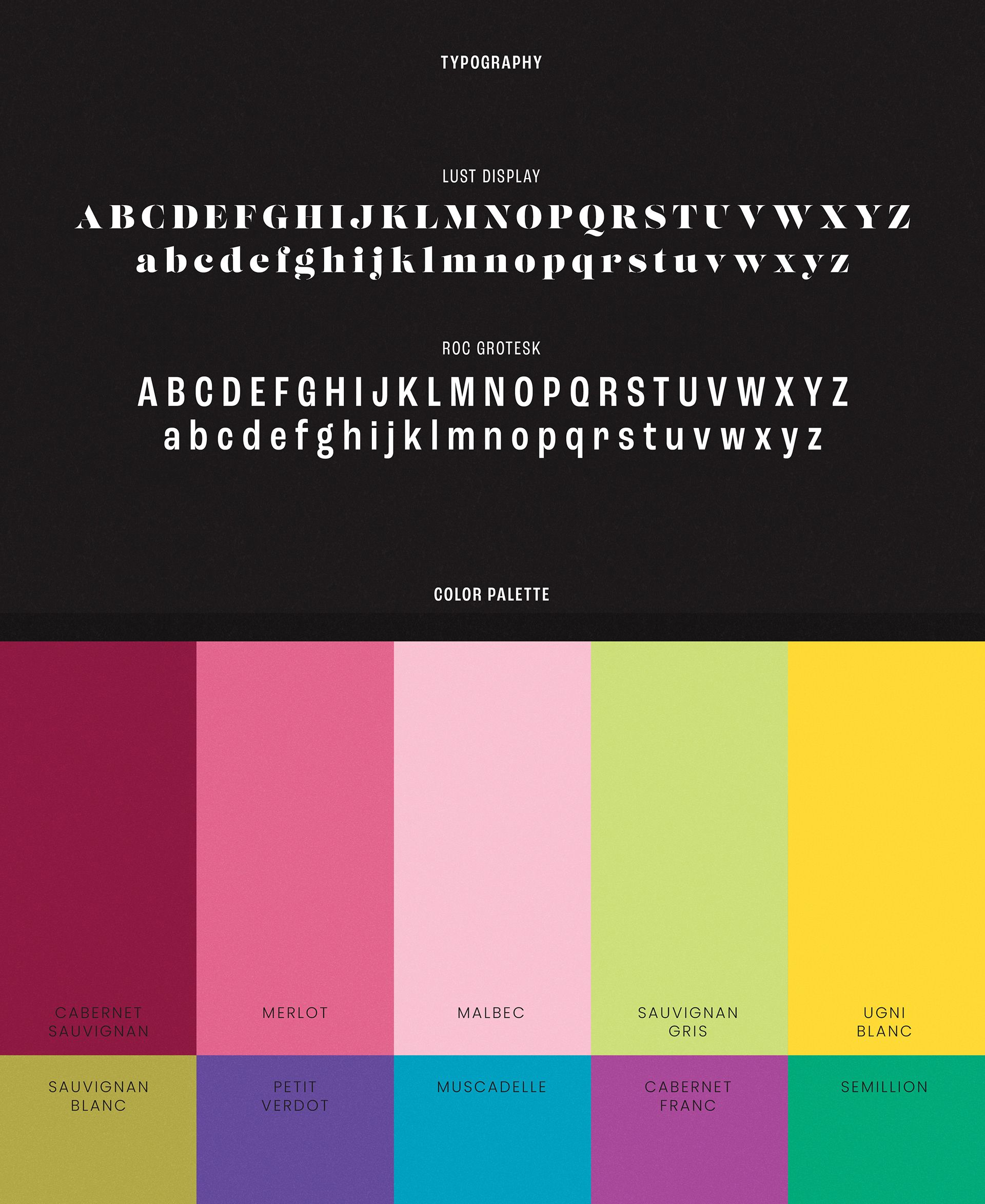
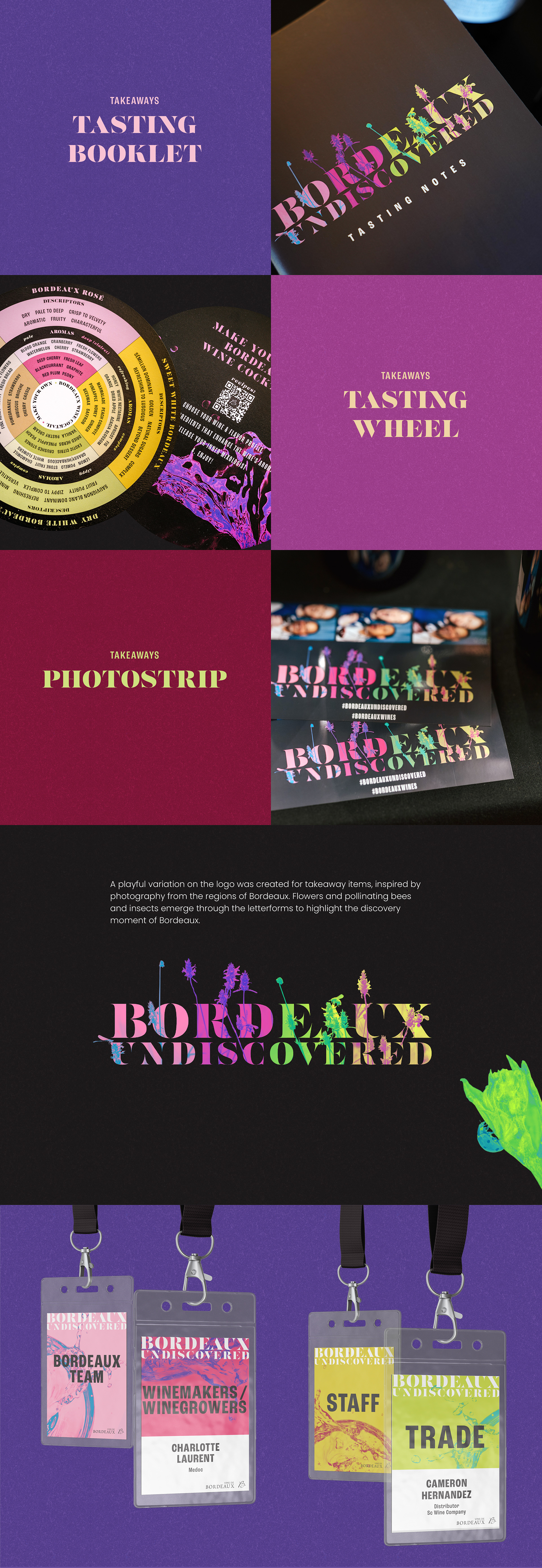
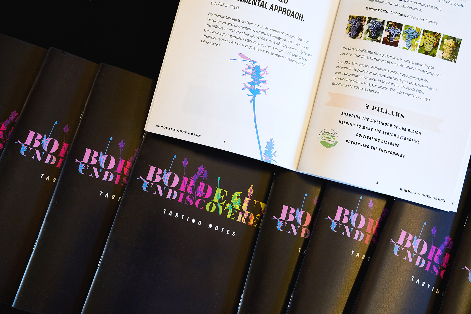
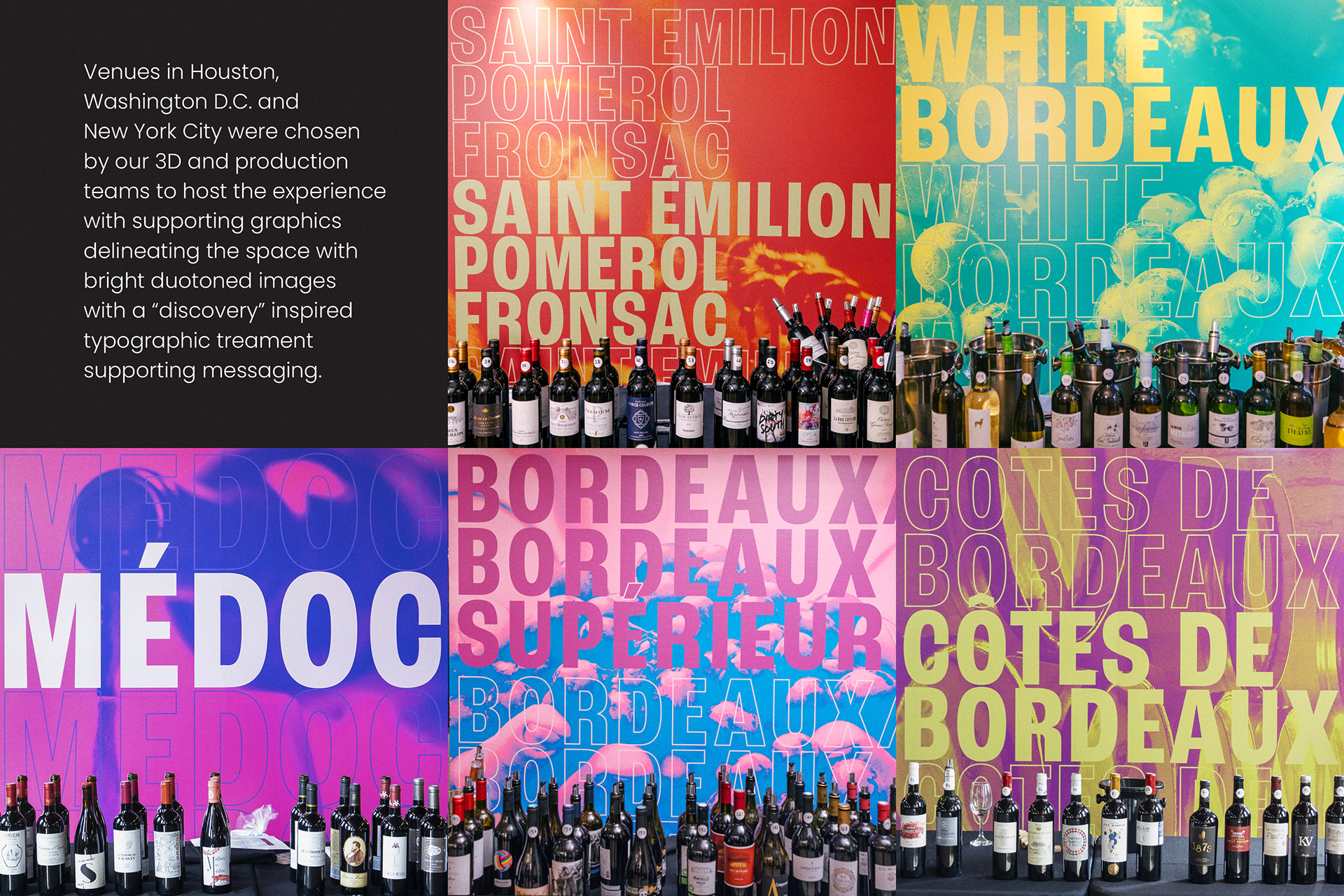
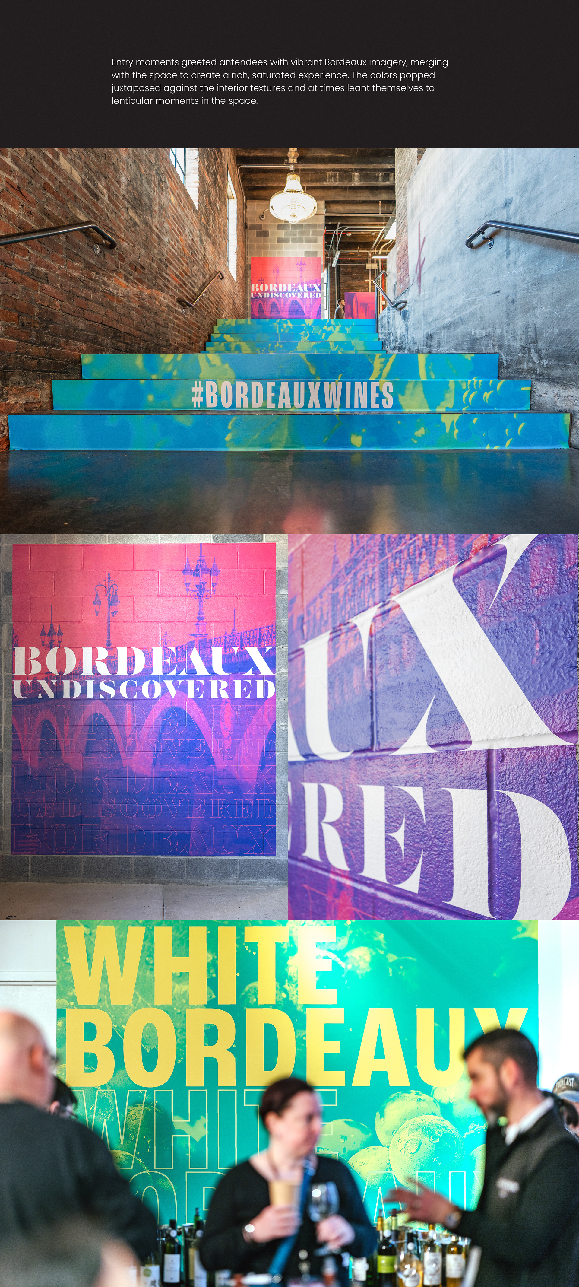
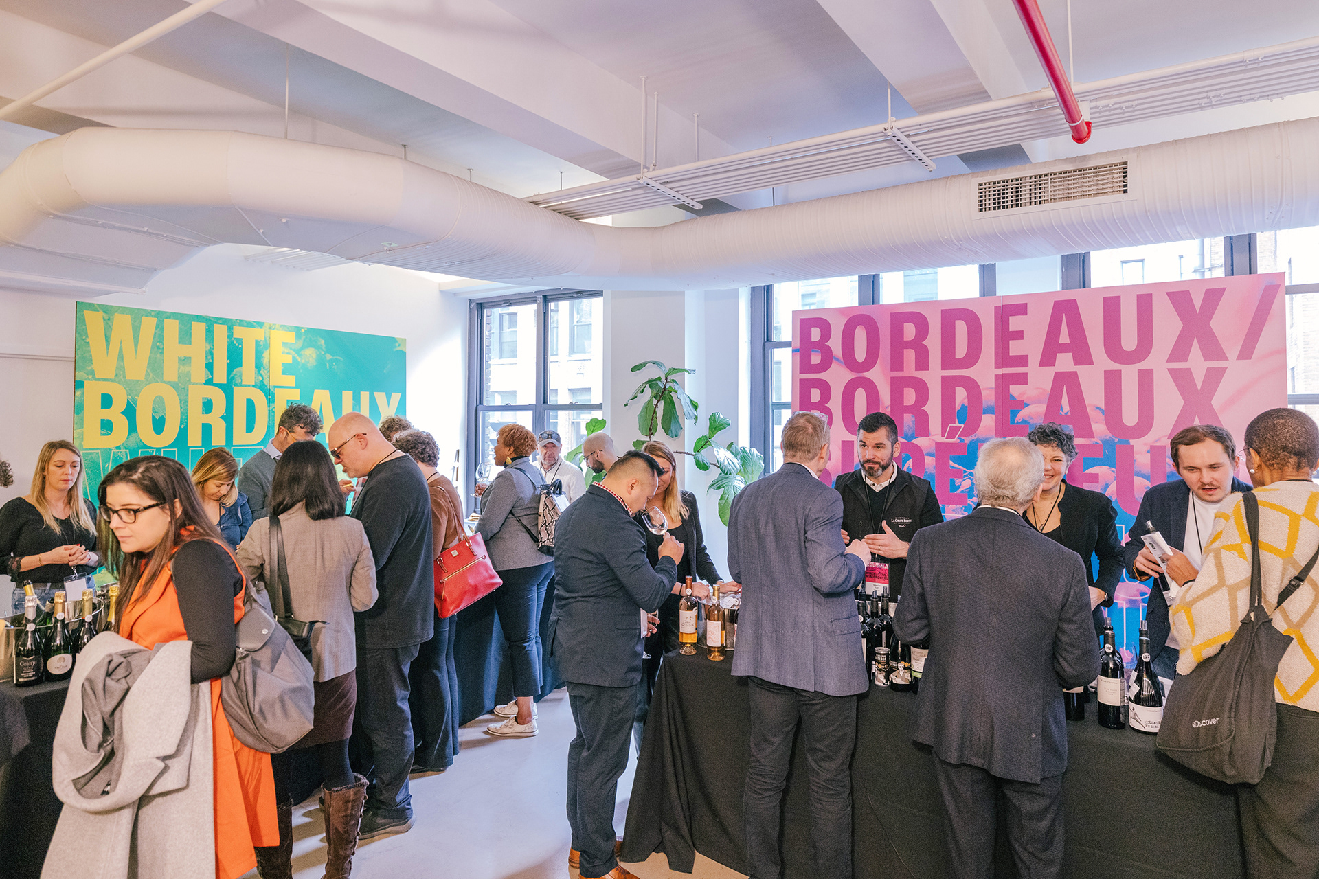
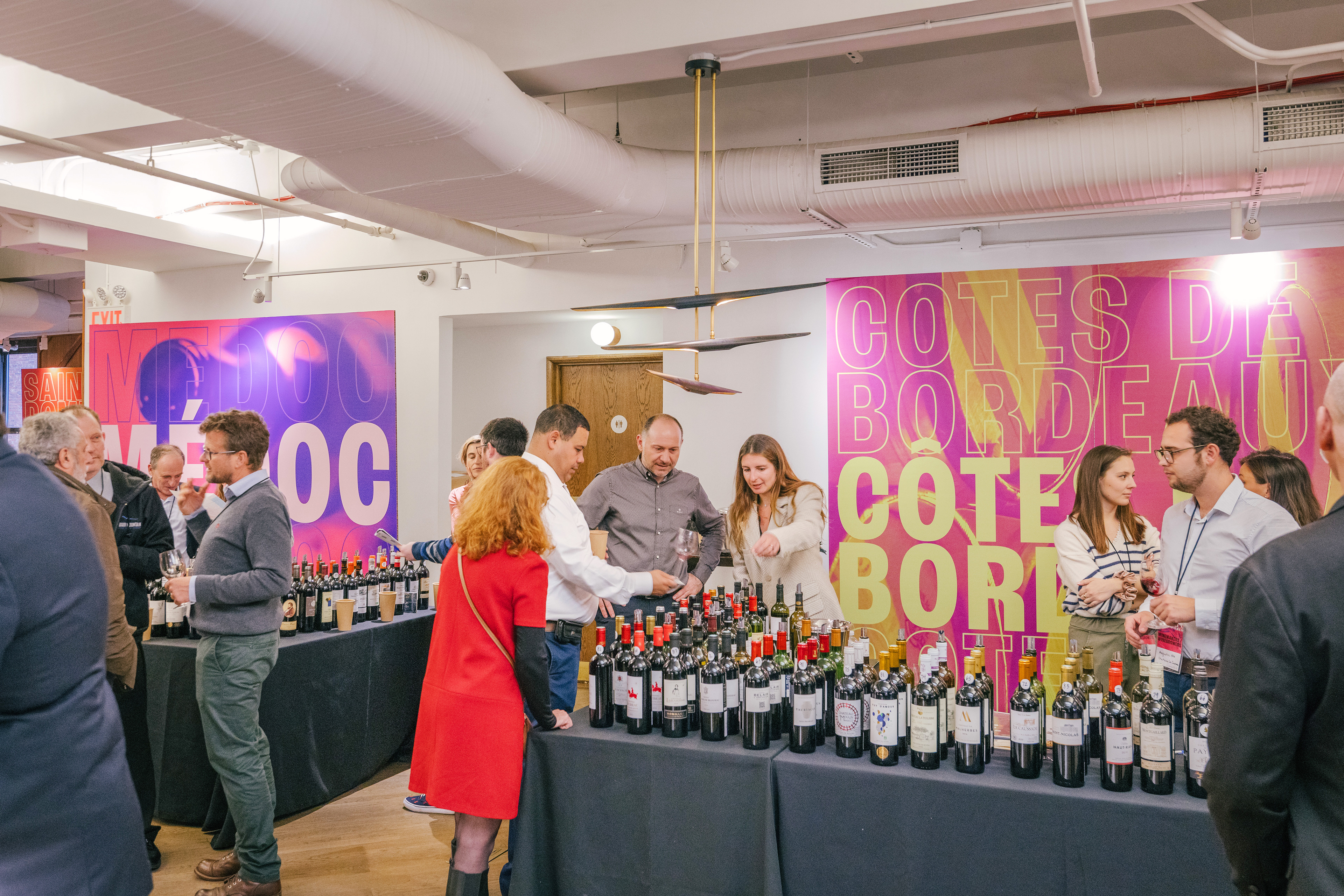
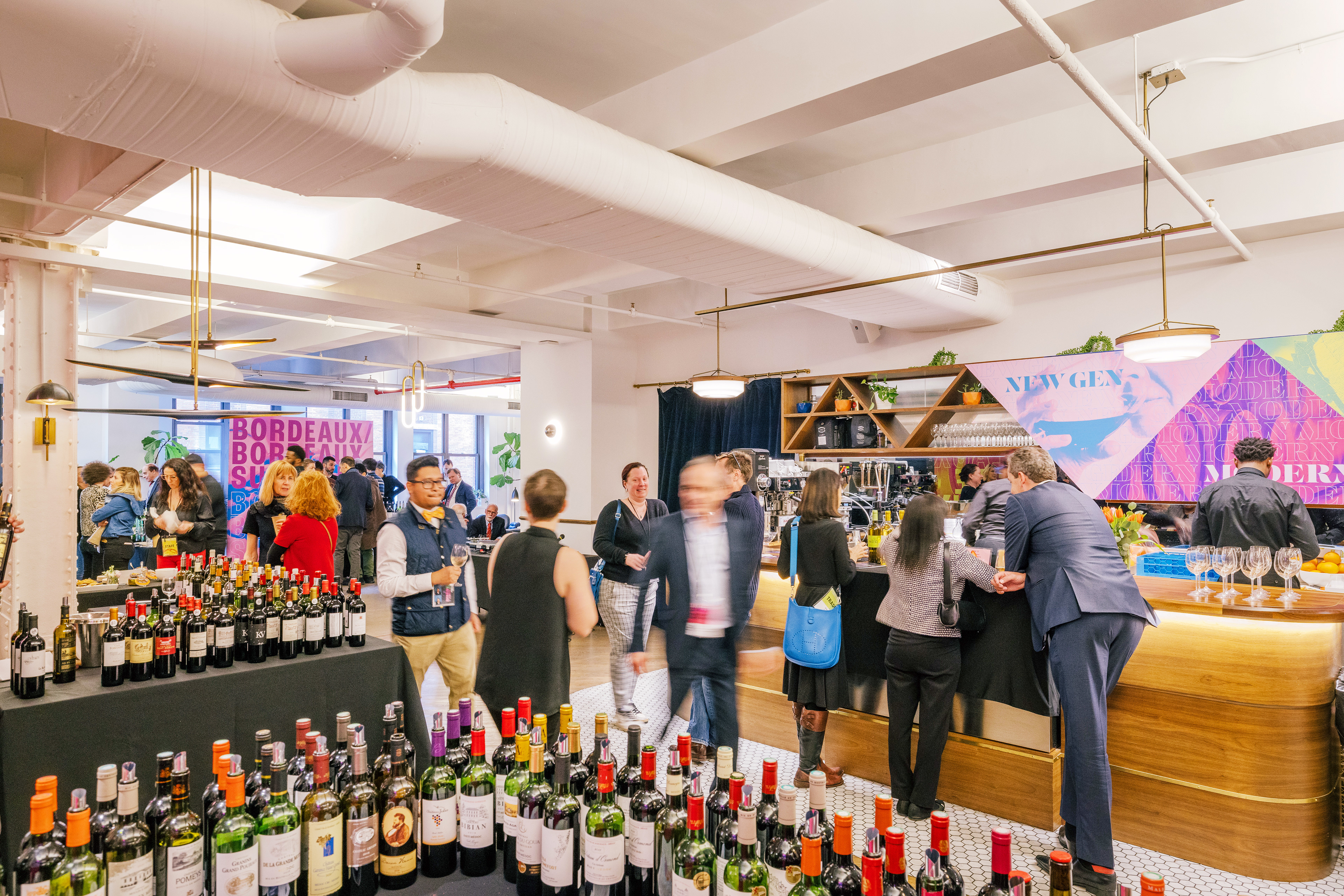
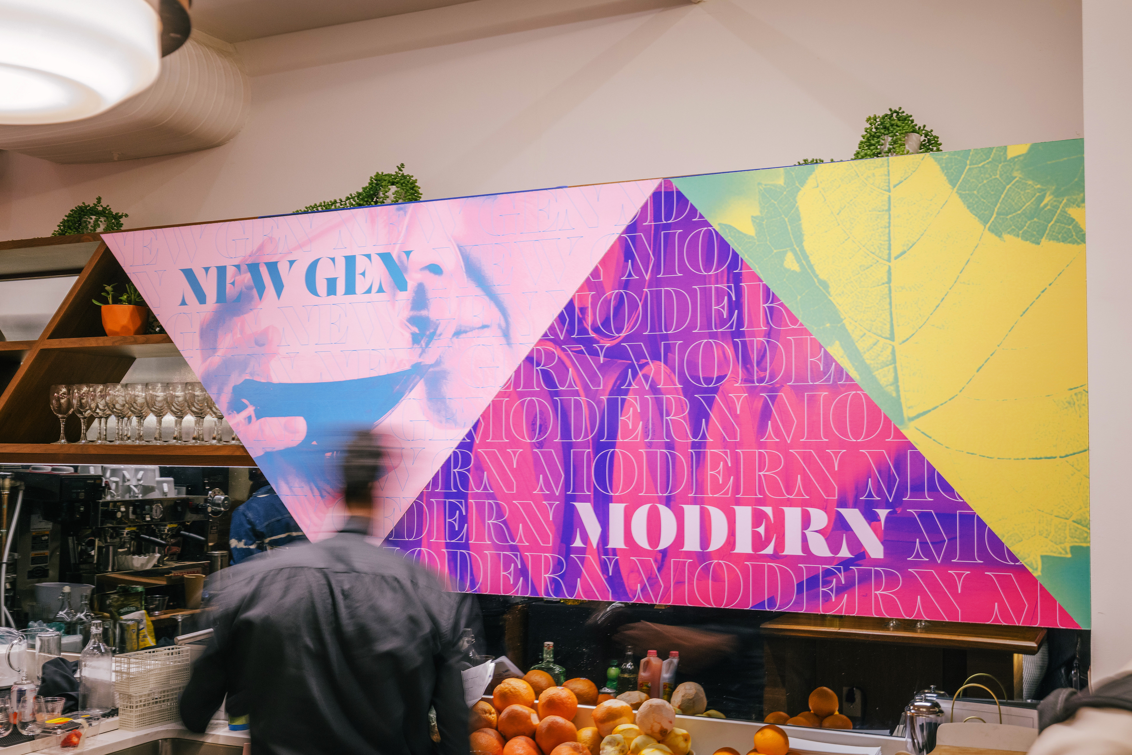
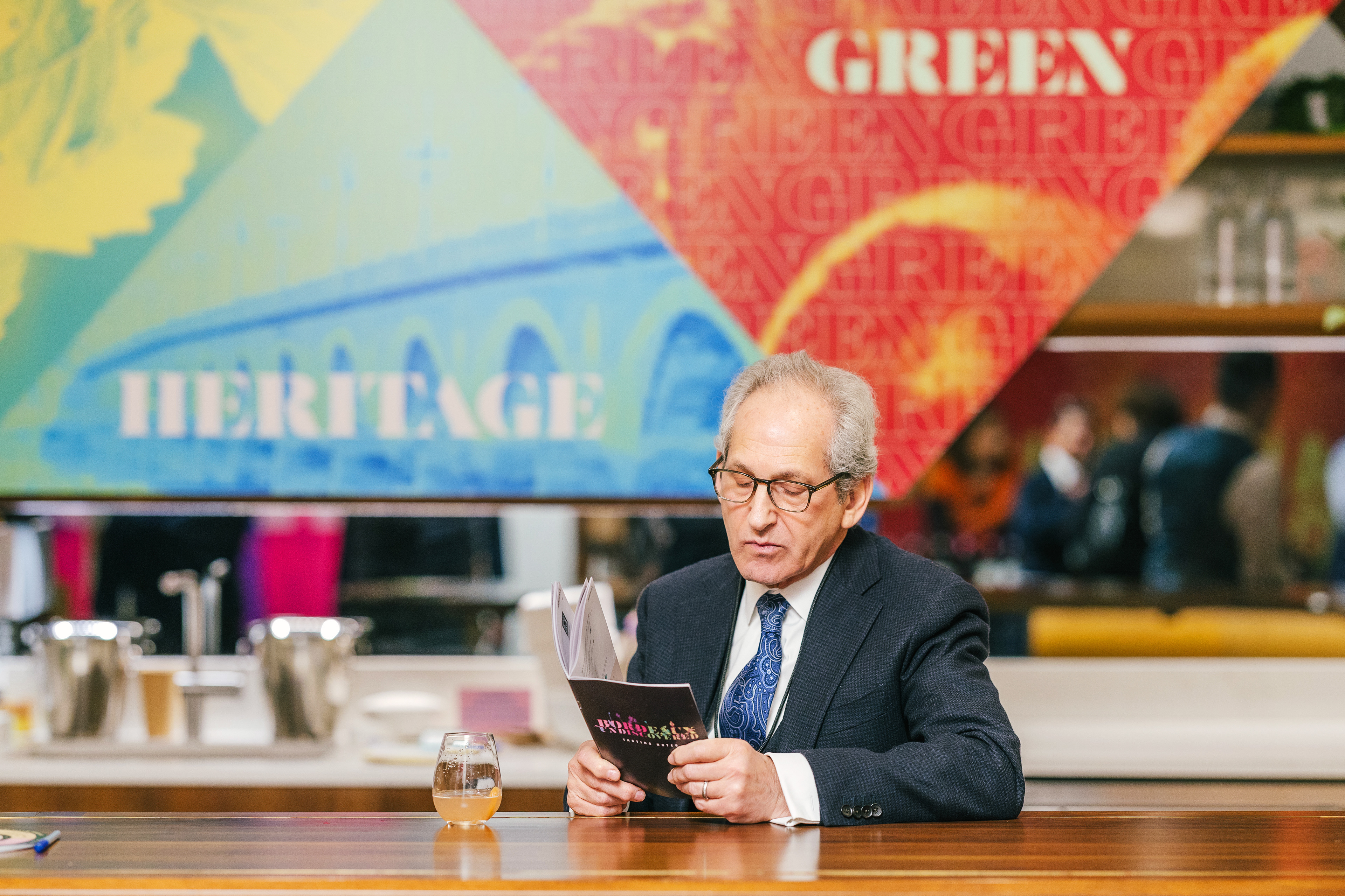
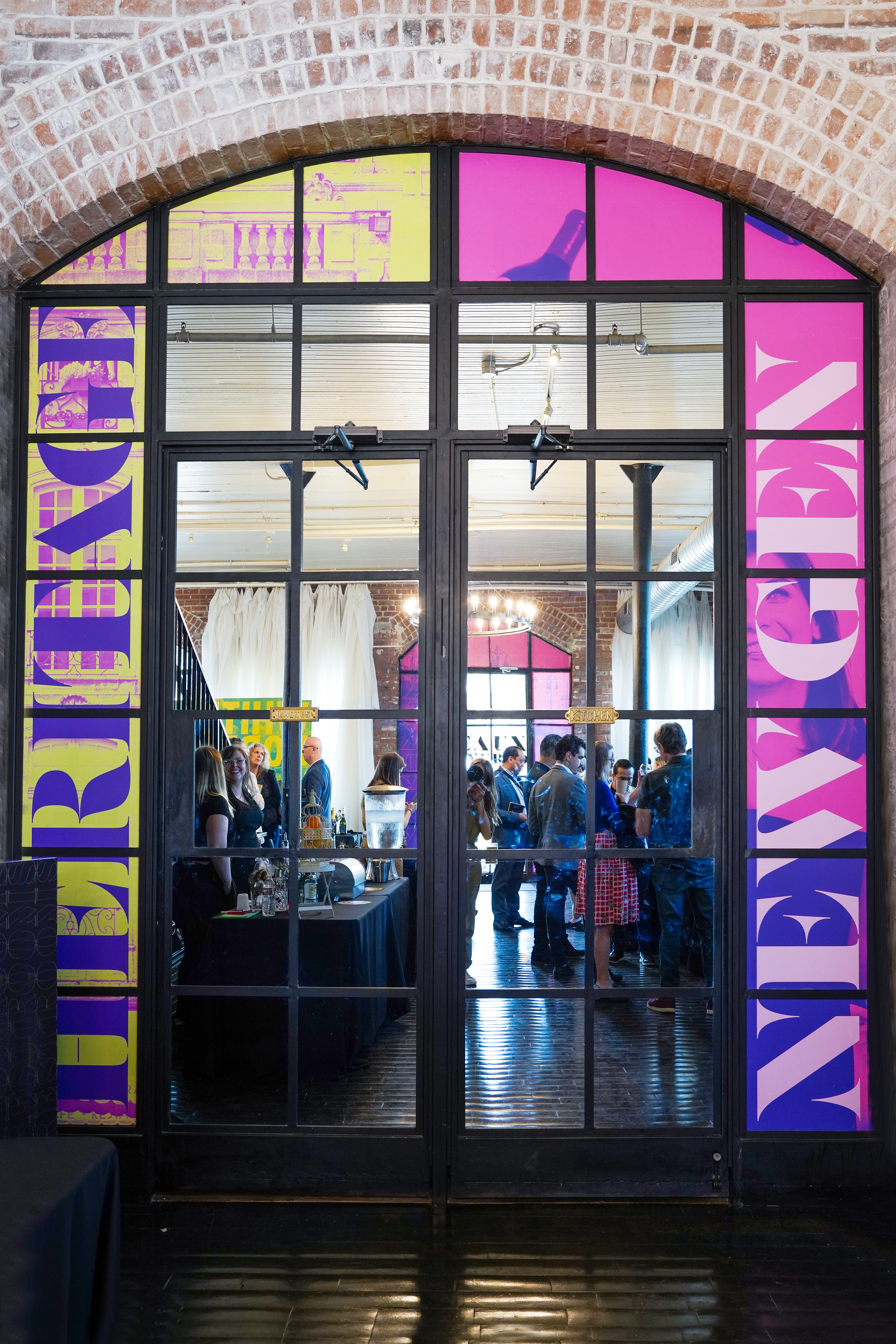
From this foundation, the concept Bordeaux Undiscovered was developed. The logotype features letterforms that subtly “disappear” at intersecting points, evoking the moment of discovery. This idea extends through the typographic system, where outlined keywords and phrases gradually reveal themselves in full color throughout the environment.
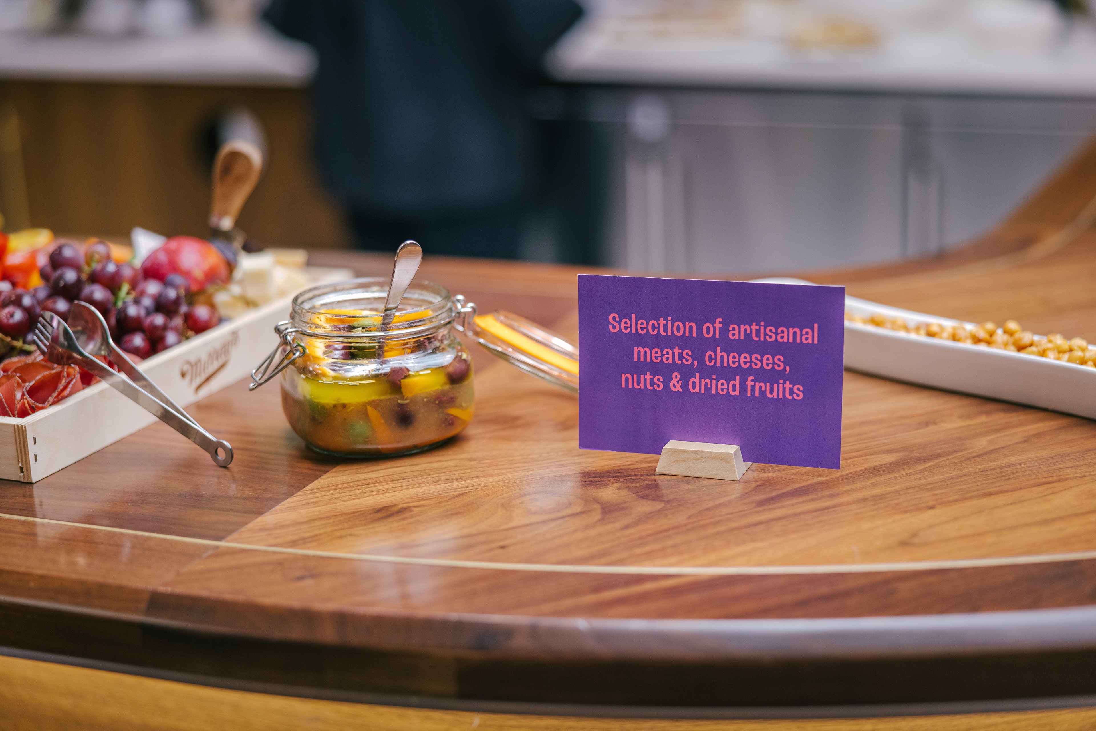
Photography played an equally important role in shaping the atmosphere. Macro imagery was selected to create an intimate, sensory environment—inviting viewers to feel as though they could reach out and touch the curve of a wine glass or the dew on a grape, rather than observing distant vineyard landscapes. To further bridge Bordeaux’s rich tradition with a contemporary U.S. audience, vibrant duotone treatments—carefully paired to complement the color of each wine—were applied across imagery. The result was a modern, visually striking system that celebrated the heritage of Bordeaux while presenting it through a fresh and inviting lens for a new generation of wine drinkers.