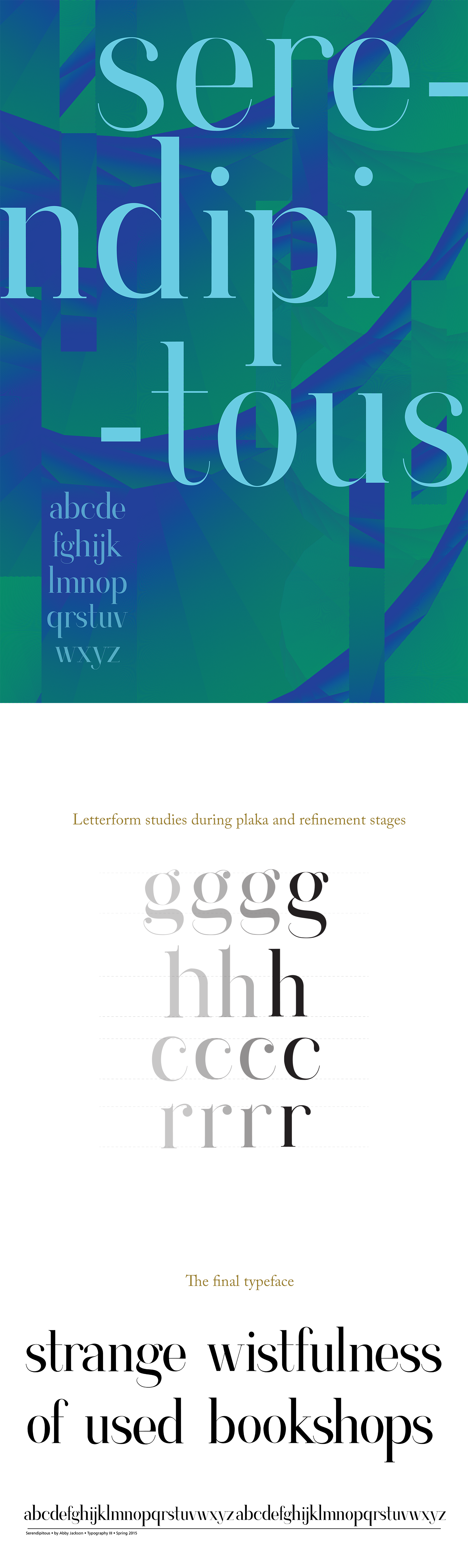
Contrary to what the name implies, the Serendipitous typeface was concepted and created after many letterform studies inspired by the typefaces Didot and Baskerville. By researching the contrasting stroke weights, brackets, curves, and x-heights, as well as the addition and exploration of ball and tear drop terminals, Serendipitous was created. Used primarily as a display typeface, my overall research goal was to focus on a place in between the realm of display and text typefaces. Initially visualized to be noticed by its extreme curved bracket and ball terminal, many iterations later found a balance between a slab and curved bracket serif accompanied by a more refined teardrop terminal.